When I first shared about the home we bought, I mentioned that it wasn't a major fixer upper. by this I mean it wasn't in need of major repairs, such as structural issues. but being built in the 80s, it needed a little updating.
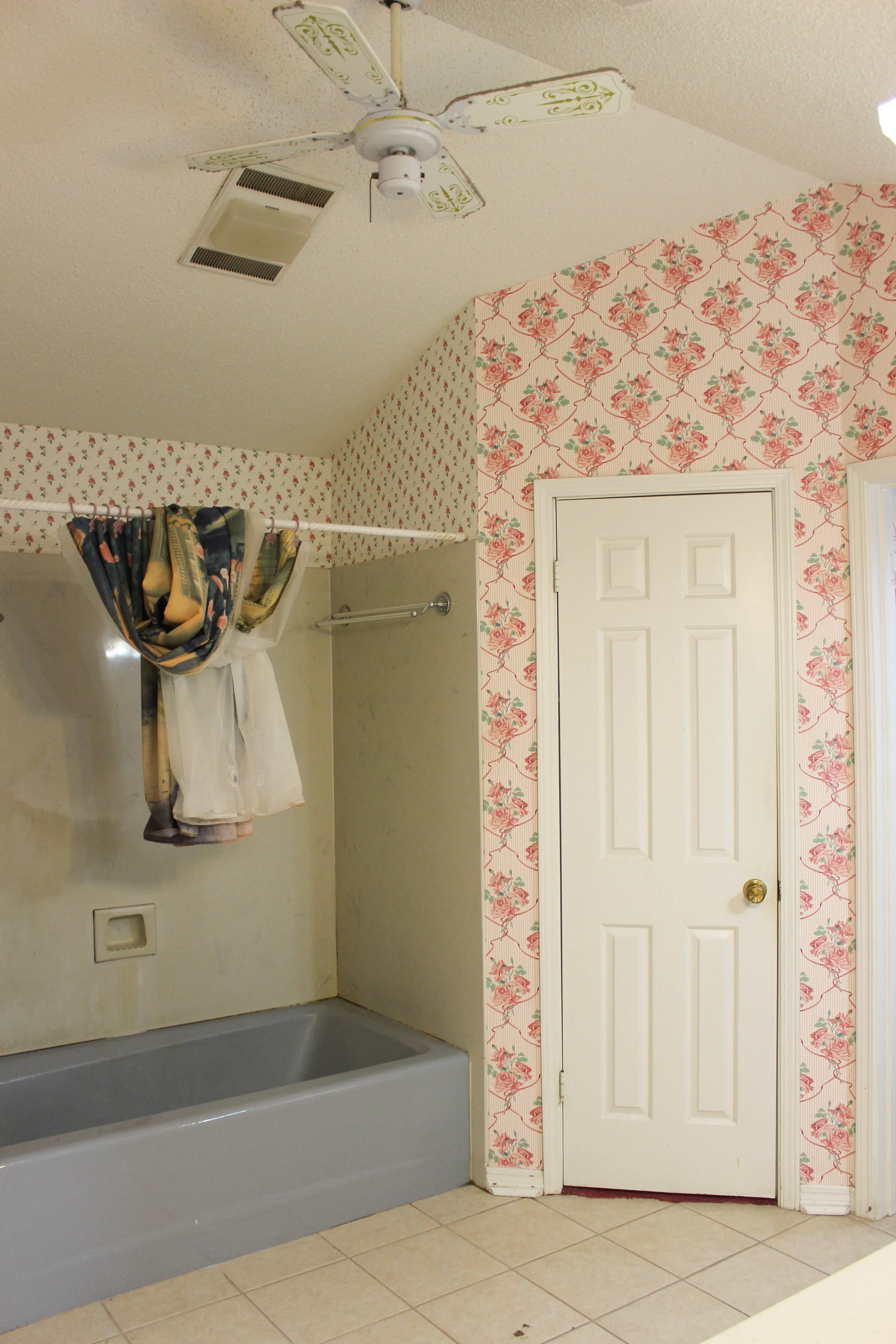
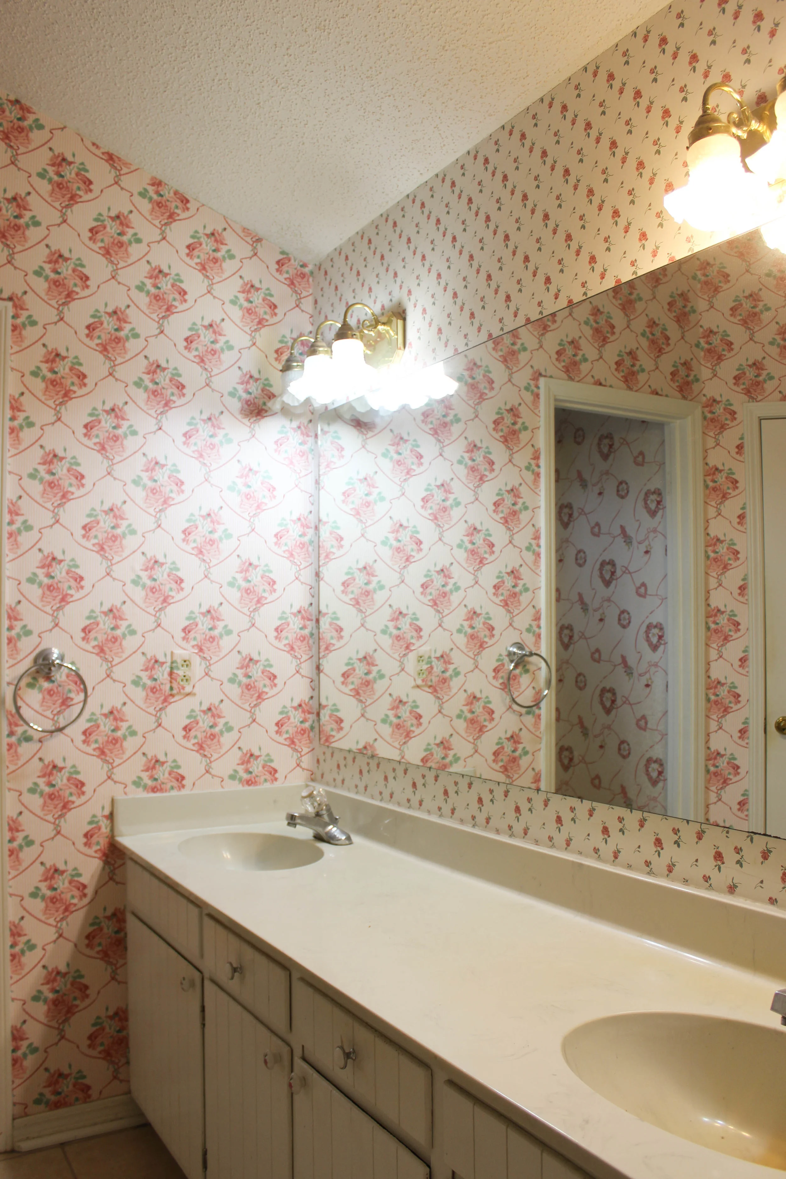
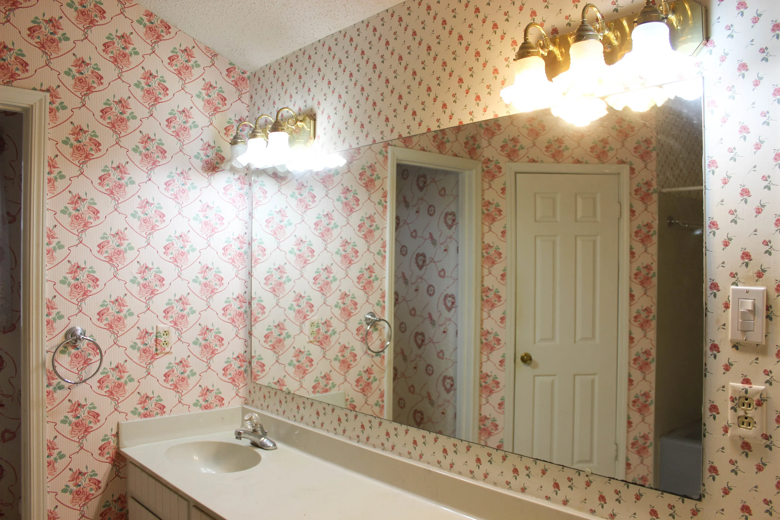
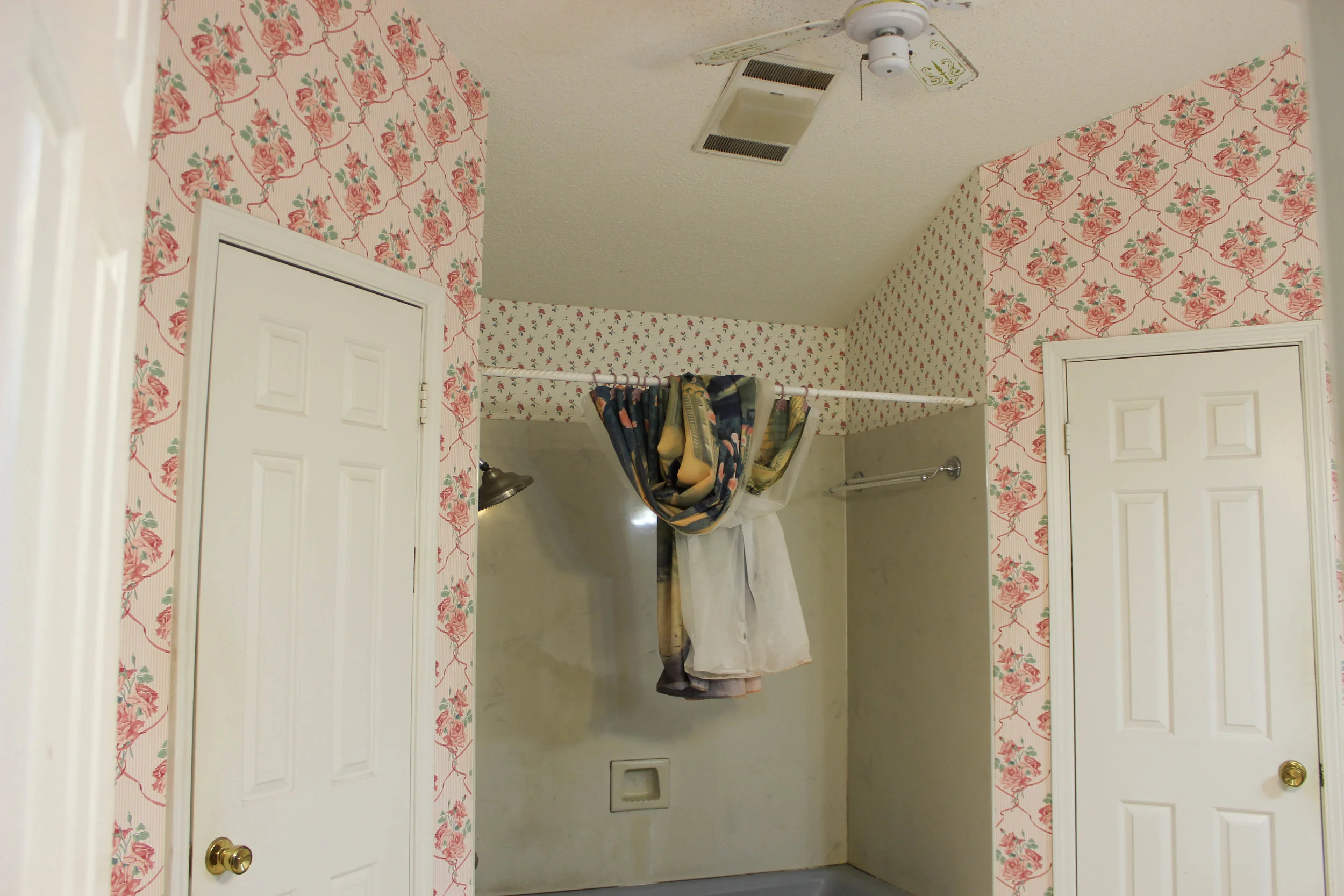
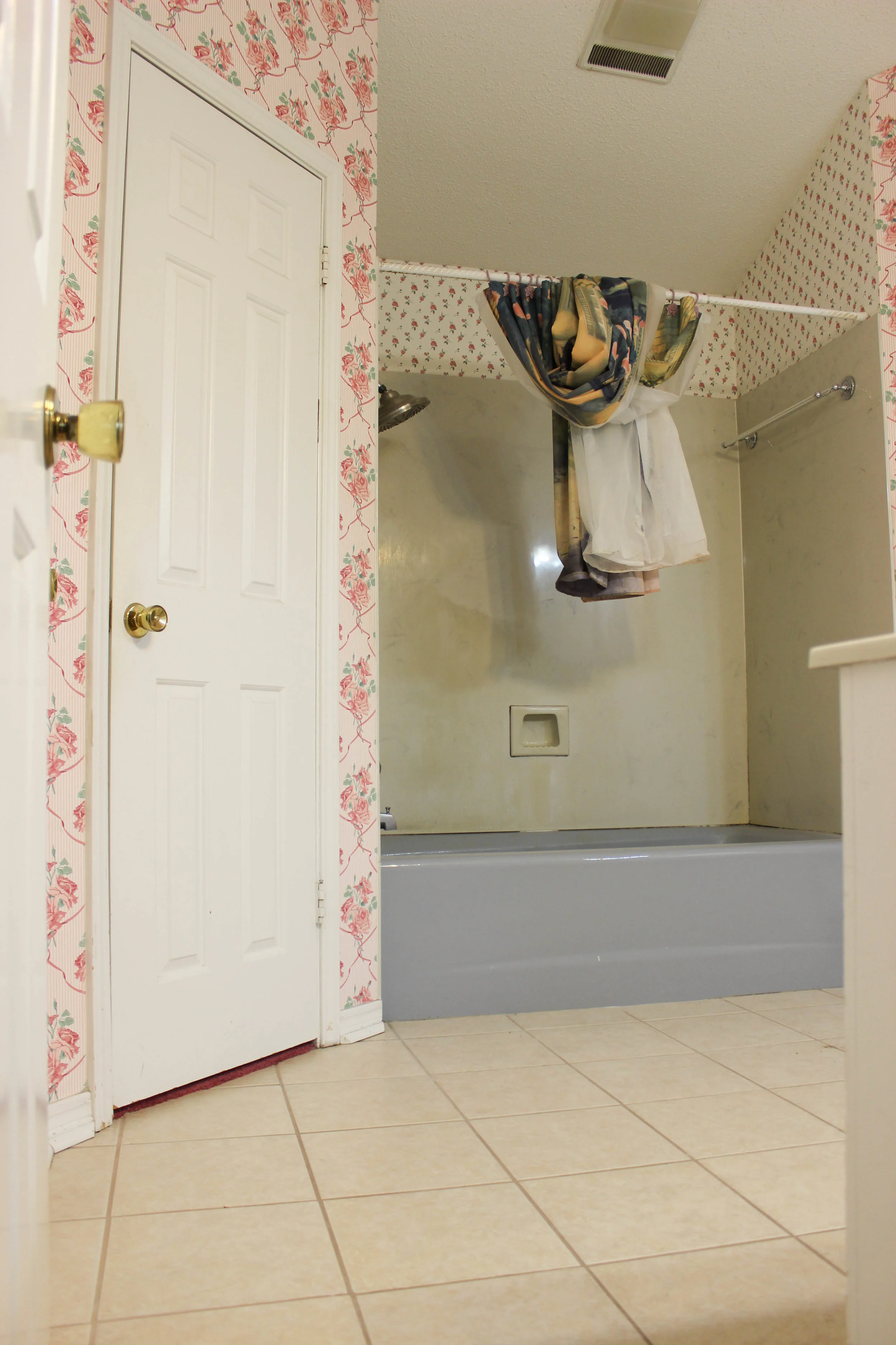
I truly love the whole house. it's very classic and has such good bones, but nearly every room had wallpaper or some type of border and outdated fixtures. the master bathroom may have been the room that needed updating most.
like the rest of the house, it needed some love; but it had lots of potential. such as:
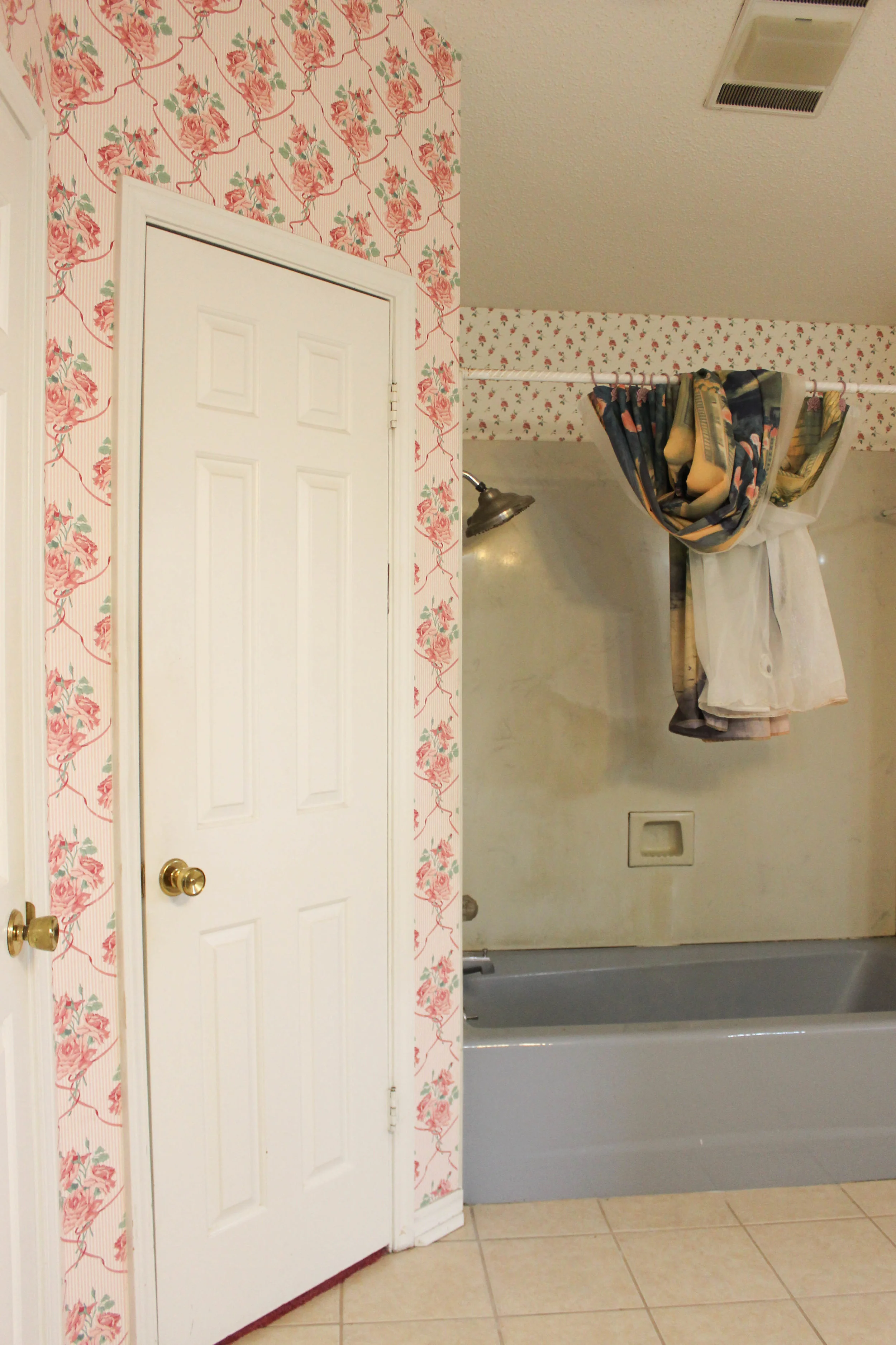
- his + her closets -- this was huge for us because the original tiny white house only had one closet in the entire house
- a linen closet
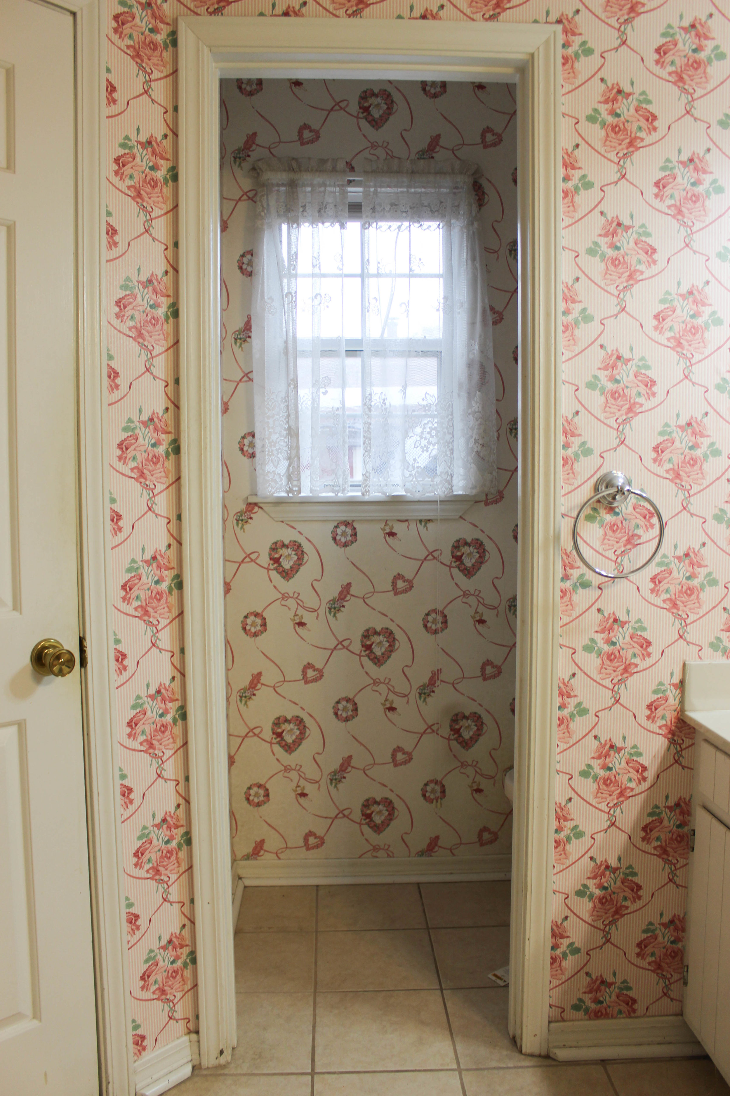
- separate toilet room
- large space for vanity
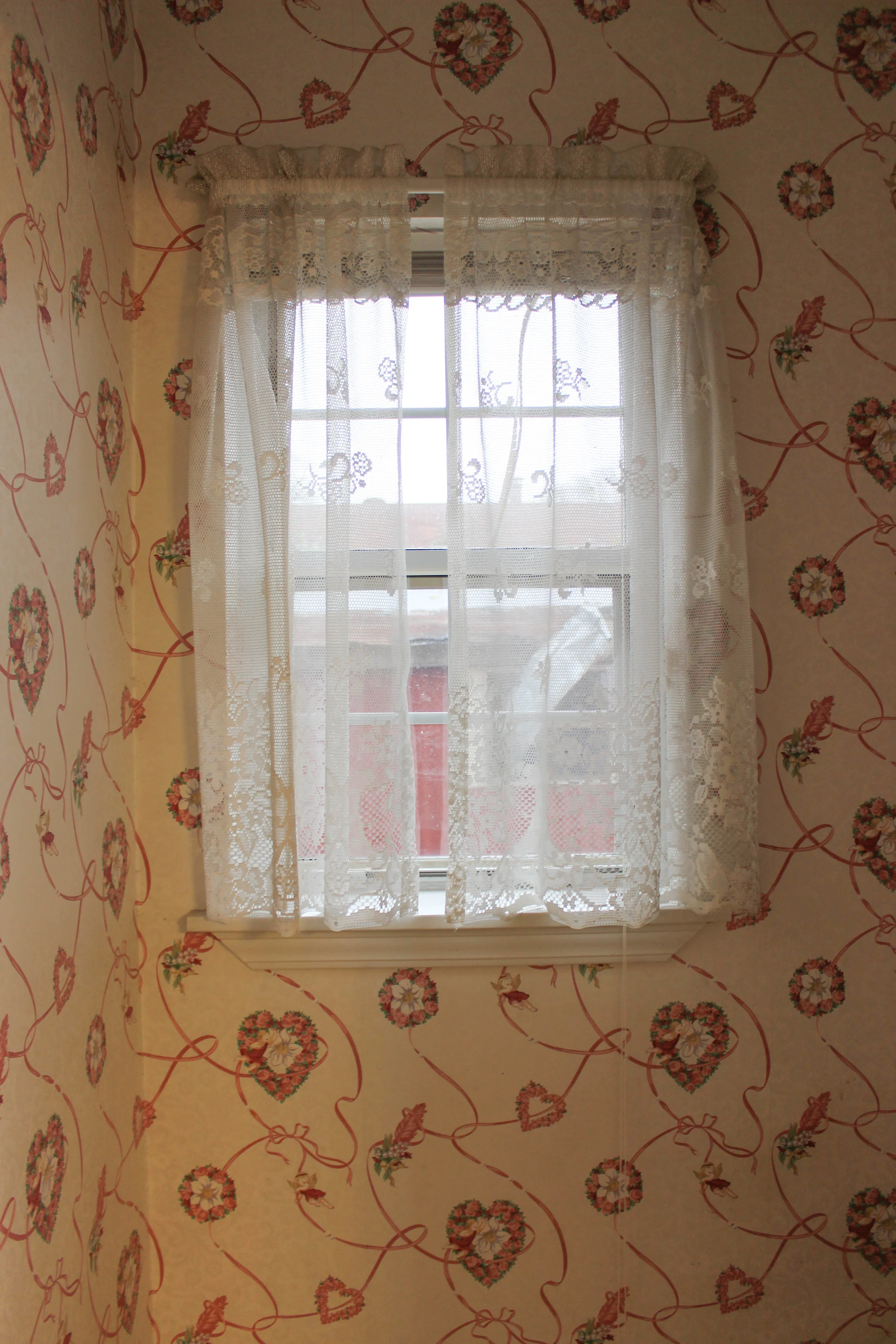
- a window — this was exciting to me because I love windows + natural light
- high ceilings
and then there were the not-so-good things:
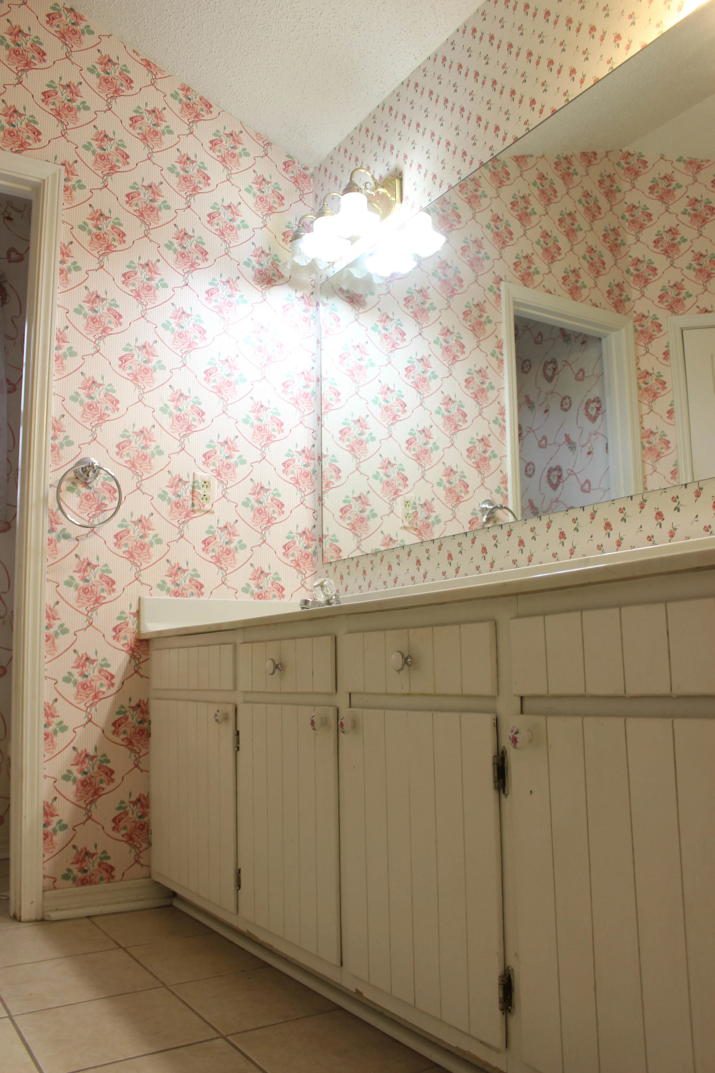
- wallpaper everywhere — and not just one, but three complementing patterns
- a blue-gray tub
- a vanity that took up a little too much space
- outdated fixtures
- outdated + grossish tub surround
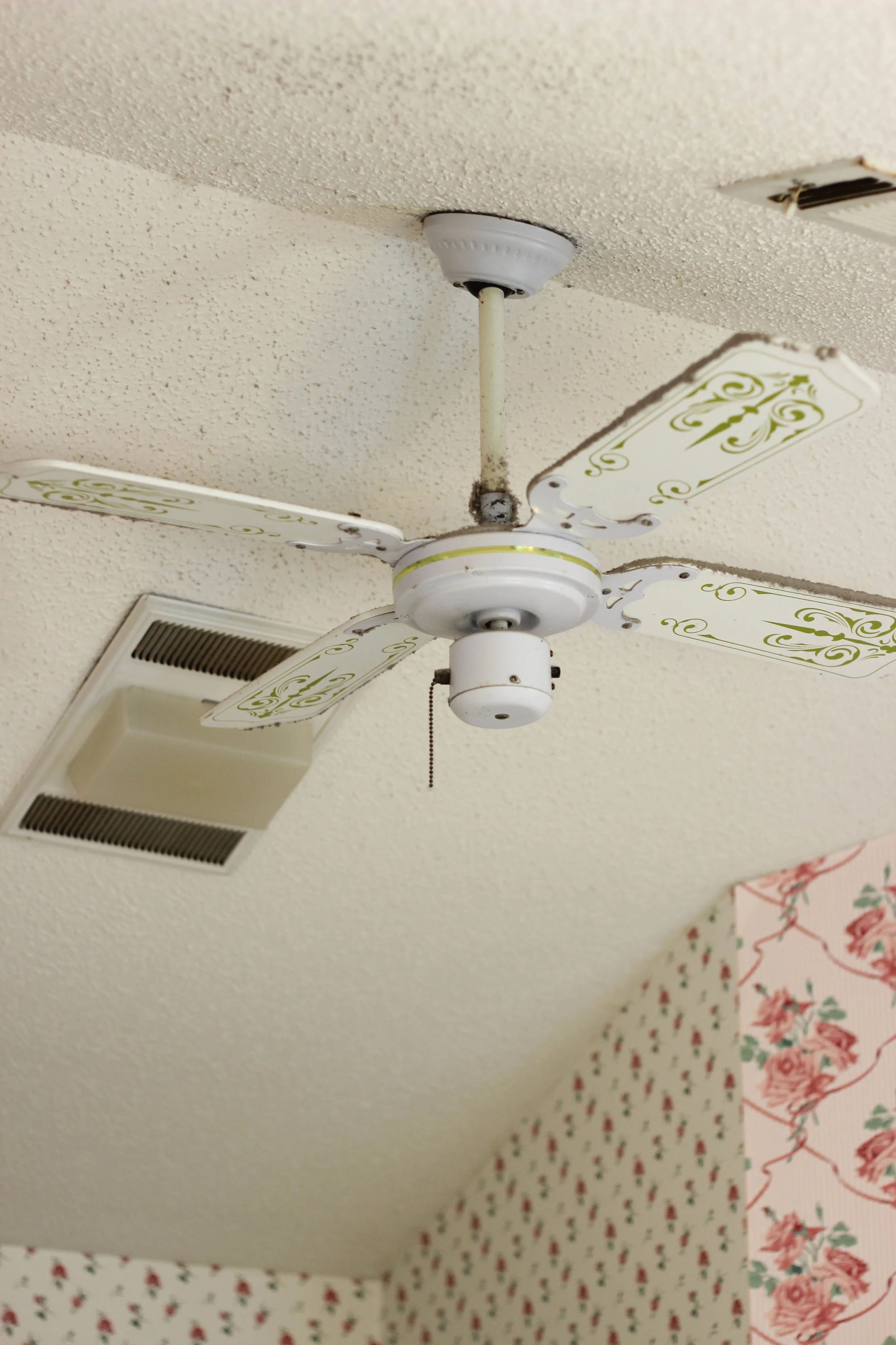
- popcorn ceilings
I had a vision in mind of what I wanted, but our budget was tight. here's what I knew: the wallpaper had to go, the ceilings needed to be scraped, the vanity + tub surround would be ripped out, the ceiling fan would be replaced with a light fixture, and all fixtures would be updated.
we knew when we bought the house, we needed to do as much of the work as we could ourselves. I have always had a knack for decorating + fixing things up, so I was thrilled about this. but as we got into this adventure, I realized it wasn't possible for us to do everything ourselves. and frankly, it wasn't wise either. there are certain things one can get away with doing themselves, but some stuff should be left to the pros, or the brave/extreme DIYers.
in our case, we did all the painting. after getting a quote and realizing the cost for a professional to do it was the same amount as the budget for the entire house, that got scratched off the list fast. we did decide, however, to splurge and let professionals do the flooring + tiling. I'll share more about that with each room; but for the master bath, we hired someone to lay new tile for the floor and install a new tub surround.
the old bathroom tile, which is also in our living room, isn't terrible. it's not exactly my first choice, but it could be much worse. I think it had been updated at some point since the house was built. I knew we were ripping out the vanity, though, and there wouldn't be any tile underneath it, so we decided to rip it all up and put something new down. one area we were able to "save" in our master bath reno was to rip the old tile up ourselves. and obviously, when I say "ourselves," I mean my husband. he scraped every popcorn ceiling, as well. he's the best ever.
Now you have an idea of what we were working with. ready to see the transformation?
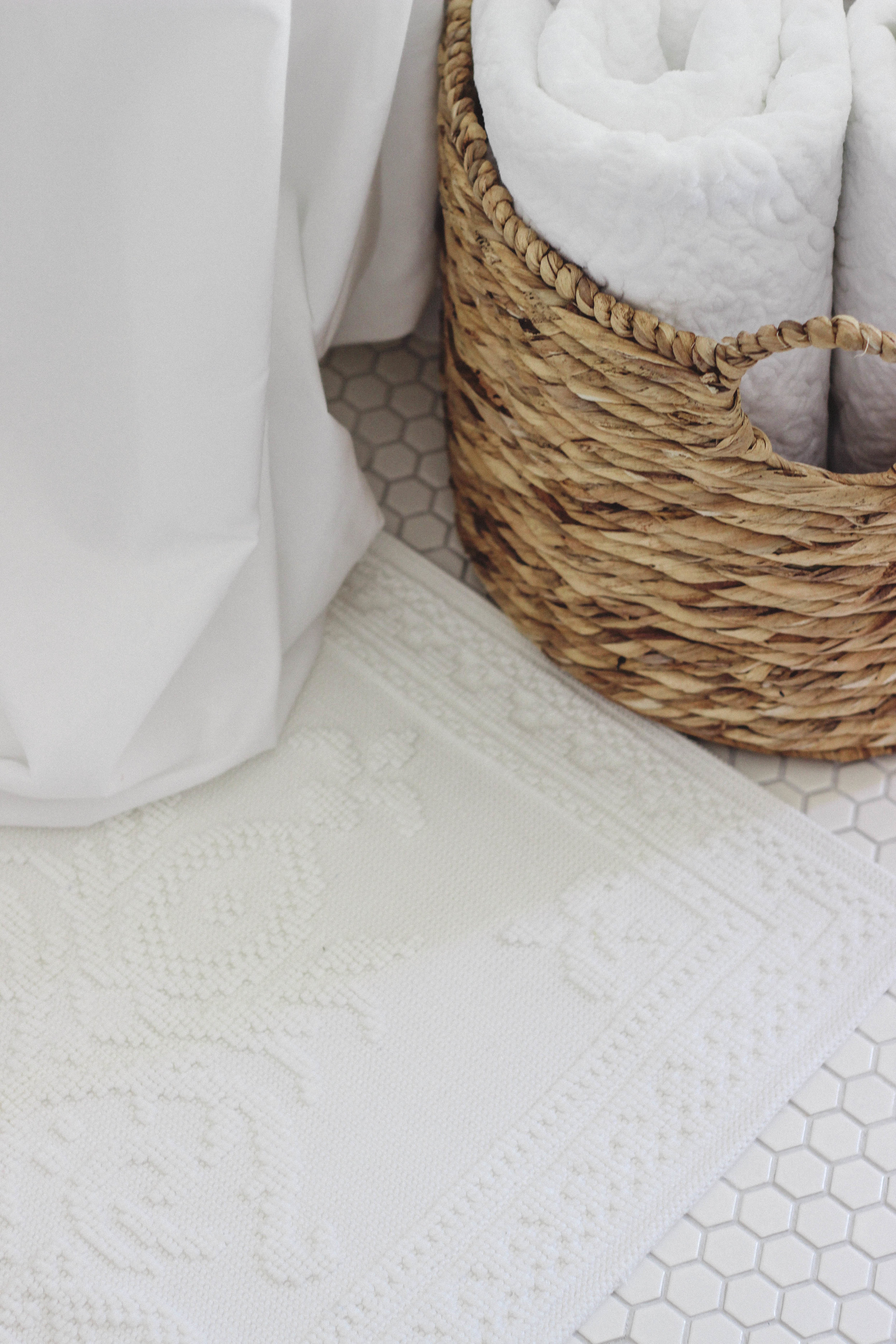
I decided on a small, white hexagon tile for the new bathroom tile. I know this is "in" right now, but it was also used in bathrooms a hundred years ago. something you should know about me is that I hate to be trendy or do what everyone else is doing. so, my decision to install hexagon tile was purely because 1) I liked the clean look of it and 2) it's timeless. I chose a light gray for the grout color. I wish I had gone a little darker, but overall, I am pleased with it.
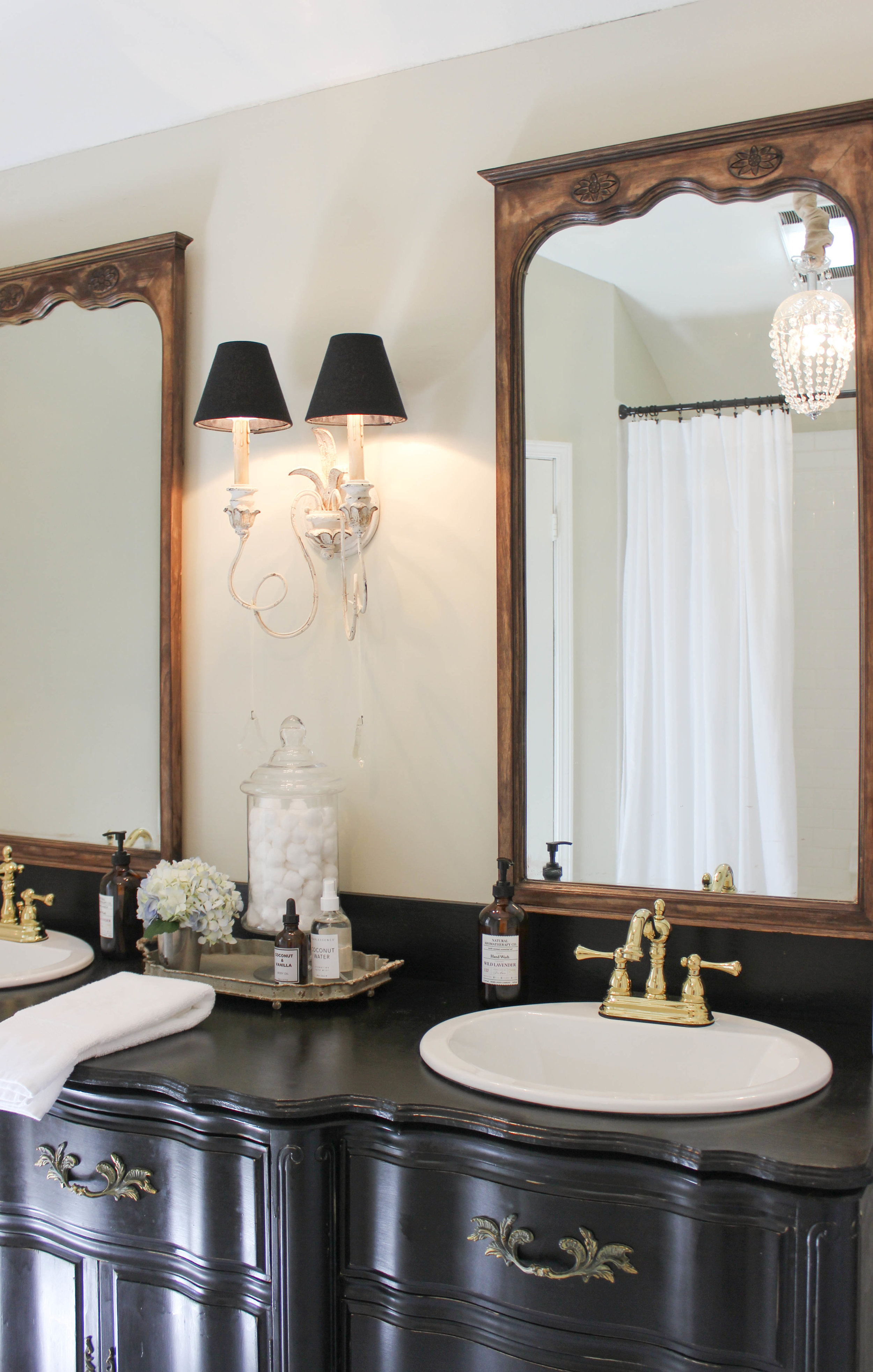
some of the generous people that took care of us during the flood gave us a dresser that I refinished and we used as our vanity. I wanted to strip it and stain it; but for the sake of time, I decided just to paint it. I used this chalk paint in Boot Black and sealed it with a satin polyurethane. I wish there wasn't as much of a sheen to it, but I suppose that's the tradeoff for using a dresser as a bathroom vanity. I stripped and stained the mirrors that belong to this vanity, and I'm so happy I did because I really wanted to feature some dark wood in the bathroom somewhere.
The old vanity had one large sheet mirror and since we were going from one mirror to two smaller mirrors, I asked [read: begged] my husband to change the electrical wiring so we could do a wall sconce in the center, rather than two overhead light fixtures. he made this happen, and I found our light fixture on Wayfair. I really love it. I added these crystal prisms that I found in a junk store and a little sheer ribbon from a craft store.
Once we realized the blue-gray tub was cast iron + porcelain, we decided to keep it and refinish it. this worked best with our budget; and I knew once a new tub surround was installed, the whole thing would look brand new. after some research, I ordered a tub + tile refinishing kit and my dad refinished both the upstairs and downstairs tubs. we chose a white subway tile for the tub surround. again, I'm going with the timeless factor over the trendy factor.
After scraping and painting the ceilings, we exchanged the old ceiling fan for a little teardrop chandelier I found at an antique store. I added a ceiling medallion I found at Lowe's to give it a little something extra. this is one of my favorite details.
I made our window treatment following a tutorial by Miss Mustard Seed. I'm certainly a beginner when it comes to sewing, so don't look too closely. however, I love the simplicity of this little valance. I plan to make something similar for the upstairs bathroom eventually.
I love the way our bathroom renovation turned out. such a transformation! it was especially fun to see this space transform right before our eyes. I love just stepping into this room and soaking in that pretty painted tub. it's amazing what a little paint, a little money, and a lot of hard work can do for a room.
sources:
sinks | Kohler via Lowe's
faucets | Kingston Brass via Wayfair
hexagon tile | American Olean via Lowe's
subway tile | American Olean via Lowe's
shower + tub faucet | Delta via Home Depot
wall sconce | One Allium Way via Wayfair
tub + tile kit | Rust-Oleum Tub & Tile Refinishing Kit via Home Depot


